
Creating CSS3 Dropdown Menu
During last several years, CSS-based menus are becoming more and more popular. Almost any website have own navigation menu, and quite often the menu plays a major role in mapping the site. Just because this is great solution to display lot of links and keep clean layout. Today I will show you how to create your own multilevel CSS3 dropdown menu (without extra JS files – pure CSS). Since this menu is made using CSS3 – it renders perfect on Firefox, Chrome and Safari browsers. This menu work also in IE8+, but the rounded corners and shadow will not be rendered.
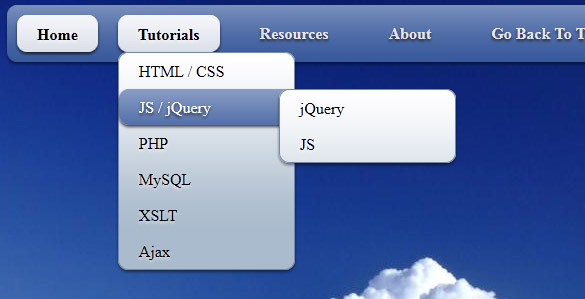
Here are final result (what we will creating):
Here are samples and downloadable package:
Live Demo
[sociallocker]
download in package
[/sociallocker]
Ok, download the example files and lets start coding !
Step 1. HTML
As usual, we start with the HTML.
Here are html with our menu. As you can see – this is multi-level menu. I hope that you can easy to understand it.
index.html
<link rel="stylesheet" href="css/style.css" type="text/css" media="screen">

<div class="example">
    <ul id="nav">
        <li class="current"><a href="https://dev-school.net/">Home</a></li>
        <li><a href="https://dev-school.net/">Tutorials</a>
            <ul>
                <li><a href="https://dev-school.net/category/html-css/">HTML / CSS</a></li>
                <li><a href="https://dev-school.net/category/jquery/">JS / jQuery</a>
                    <ul>
                        <li><a href="https://dev-school.net/category/jquery/">jQuery</a></li>
                        <li><a href="https://dev-school.net/category/javascript/">JS</a></li>
                    </ul>
                </li>
                <li><a href="https://dev-school.net/category/php/">PHP</a></li>
                <li><a href="https://dev-school.net/category/mysql/">MySQL</a></li>
                <li><a href="https://dev-school.net/category/xslt/">XSLT</a></li>
                <li><a href="https://dev-school.net/category/ajax/">Ajax</a></li>
            </ul>
        </li>
        <li><a href="https://dev-school.net/category/resources/">Resources</a>
            <ul>
                <li><a href="https://dev-school.net/category/resources/">By category</a>
                    <ul>
                        <li><a href="https://dev-school.net/category/php/">PHP</a></li>
                        <li><a href="https://dev-school.net/category/mysql/">MySQL</a></li>
                        <li><a href="https://dev-school.net/category/xslt/">XSLT</a></li>
                        <li><a href="https://dev-school.net/category/ajax/">Ajax</a></li>
                    </ul>
                </li>
                <li><a href="https://dev-school.net/category/resources/">By tag name</a>
                    <ul>
                        <li><a href="https://dev-school.net/tag/captcha/">captcha</a></li>
                        <li><a href="https://dev-school.net/tag/gallery/">gallery</a></li>
                        <li><a href="https://dev-school.net/tag/animation/">animation</a></li>
                    </ul>
                </li>
            </ul>
        </li>
        <li><a href="https://dev-school.net/about/">About</a></li>
        <li><a href="https://dev-school.net/creating-css3-dropdown-menu/">Go Back To The Tutorial</a></li>
    </ul>
</div>
Step 2. CSS
Here are used CSS styles. First two selectors (you can skip it) belong to our demo page. All rest – belong to menu.
css/style.css
/* demo page styles */
body {
    background:#eee;
    margin:0;
    padding:0;
}
.example {
    background:#fff url(../images/clouds-in-blue-sky.jpg);
    width:770px;
    height:570px;
    border:1px #000 solid;
    margin:20px auto;
    padding:15px;
    border-radius:3px;
    -moz-border-radius:3px;
    -webkit-border-radius:3px;
}


/* main menu styles */
#nav {
    display:inline-block;
    width:100%;
    margin:0px auto;
    padding:0;
    background:#335599 url(../images/bg.png) repeat-x 0 -110px;

    border-radius:10px; /*some css3*/
    -moz-border-radius:10px;
    -webkit-border-radius:10px;
    box-shadow:0 2px 2px rgba(0,0,0, .5);
    -moz-box-shadow:0 2px 2px rgba(0,0,0, .5);
    -webkit-box-shadow:0 2px 2px rgba(0,0,0, .5);
}
#nav li {
    margin:10px;
    float:left;
    position:relative;
    list-style:none;
}
#nav a {
    font-weight:bold;
    color:#e7e5e5;
    text-decoration:none;
    display:block;
    padding:8px 20px;

    border-radius:10px; /*some css3*/
    -moz-border-radius:10px;
    -webkit-border-radius:10px;
    text-shadow:0 2px 2px rgba(0,0,0, .7);
}

/* selected menu element */
#nav .current a, #nav li:hover > a {
    background:#7788aa url(../images/bg.png) repeat-x 0 -20px;
    color:#000;
    border-top:1px solid #f8f8f8;

    box-shadow:0 2px 2px rgba(0,0,0, .7); /*some css3*/
    -moz-box-shadow:0 2px 2px rgba(0,0,0, .7);
    -webkit-box-shadow:0 2px 2px rgba(0,0,0, .7);
    text-shadow:0 2px 2px rgba(255,255,255, 0.7);
}

/* sublevels */
#nav ul li:hover a, #nav li:hover li a {
    background:none;
    border:none;
    color:#000;
}
#nav ul li a:hover {
    background:#335599 url(../images/bg.png) repeat-x 0 -100px;
    color:#fff;

    border-radius:10px; /*some css3*/
    -moz-border-radius:10px;
    -webkit-border-radius:10px;
    text-shadow:0 2px 2px rgba(0,0,0, 0.7);
}

#nav ul li:first-child > a {
    -moz-border-radius-topleft:10px; /*some css3*/
    -moz-border-radius-topright:10px;
    -webkit-border-top-left-radius:10px;
    -webkit-border-top-right-radius:10px;
}
#nav ul li:last-child > a {
    -moz-border-radius-bottomleft:10px; /*some css3*/
    -moz-border-radius-bottomright:10px;
    -webkit-border-bottom-left-radius:10px;
    -webkit-border-bottom-right-radius:10px;
}

/* drop down */
#nav li:hover > ul {
    opacity:1;
    visibility:visible;
}
#nav ul {
    opacity:0;
    visibility:hidden;
    padding:0;
    width:175px;
    position:absolute;
    background:#aabbcc url(../images/bg.png) repeat-x 0 0;
    border:1px solid #7788aa;

    border-radius:10px; /*some css3*/
    -moz-border-radius:10px;
    -webkit-border-radius:10px;
    box-shadow:0 2px 2px rgba(0,0,0, .5);
    -moz-box-shadow:0 2px 2px rgba(0,0,0, .5);
    -webkit-box-shadow:0 2px 2px rgba(0,0,0, .5);

    -moz-transition:opacity .25s linear, visibility .1s linear .1s;
    -webkit-transition:opacity .25s linear, visibility .1s linear .1s;
    -o-transition:opacity .25s linear, visibility .1s linear .1s;
    transition:opacity .25s linear, visibility .1s linear .1s;
}
#nav ul li {
    float:none;
    margin:0;
}
#nav ul a {
    font-weight:normal;
    text-shadow:0 2px 2px rgba(255,255,255, 0.7);
}
#nav ul ul {
    left:160px;
    top:0px;
}
Quite all css code is belong to css menu. I don`t including this into article. It always available in download package
Step 3. Images
Our menu using only single image to reach custom gradient effect. This will white-transparent image (PNG) which we will apply to different elements to make gradient. And, using background position we will able to adjust it (make more lighter or darker). Second image – just background (clouds) for our demo page.


Live Demo
Conclusion
Hope you enjoyed with this tutorial, don’t forget to tell thanks and leave a comment 🙂 Good luck!