
CSS3 Bottom navigation menu tutorial. Today I prepared nice CSS3 bottom navigation menu for you. This is will sliding drop down menu with fixed position in bottom of screen. Also, I going to use jQuery for sliding effects.
Here are final result (what we will creating):
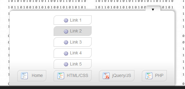
Here are samples and downloadable package:
Live Demo
[sociallocker]
download in package
[/sociallocker]
Ok, download the example files and lets start coding !
Step 1. HTML
Here are html source code of our page with menu. Whole menu built on UL-LI elements.
index.html
<!DOCTYPE html>
<html lang="en" >
    <head>
        <meta charset="utf-8" />
        <title>CSS3 Bottom navigation menu | Dev School</title>

        <link rel="stylesheet" href="css/layout.css" type="text/css" media="screen">
        <link rel="stylesheet" href="css/menu.css" type="text/css" media="screen">

        <!--[if lt IE 9]>
          <script src="http://html5shiv.googlecode.com/svn/trunk/html5.js"></script>
        <![endif]-->
        <script type="text/javascript" src="js/jquery-1.5.2.min.js"></script>
        <script type="text/javascript" src="js/script.js"></script>
    </head>
    <body>
        <div class="menuContent">
            <a class="slider"><img alt="" id="bot" src="images/arrow_bottom.png"></a>
            <ul id="nav">
                <li><a href="#"><img src="images/t1.png" /> Home</a></li>
                <li>
                    <ul id="1">
                        <li><a href="#"><img src="images/empty.gif" />Link 1</a></li>
                        <li><a href="#"><img src="images/empty.gif" />Link 2</a></li>
                        <li><a href="#"><img src="images/empty.gif" />Link 3</a></li>
                        <li><a href="#"><img src="images/empty.gif" />Link 4</a></li>
                        <li><a href="#"><img src="images/empty.gif" />Link 5</a></li>
                    </ul>
                    <a href="#" class="sub" tabindex="1"><img src="images/t2.png" />HTML/CSS</a>
                </li>
                <li>
                    <ul id="2">
                        <li><a href="#"><img src="images/empty.gif" />Link 6</a></li>
                        <li><a href="#"><img src="images/empty.gif" />Link 7</a></li>
                        <li><a href="#"><img src="images/empty.gif" />Link 8</a></li>
                        <li><a href="#"><img src="images/empty.gif" />Link 9</a></li>
                        <li><a href="#"><img src="images/empty.gif" />Link 10</a></li>
                    </ul>
                    <a href="#" class="sub" tabindex="1"><img src="images/t3.png" />jQuery/JS</a>
                </li>
                <li><a href="#"><img src="images/t2.png" />PHP</a></li>
            </ul>
        </div>
        <footer>
            <h2>CSS3 Bottom navigation menu</h2>
            <a href="https://dev-school.net/css3-bottom-navigation-menu/" class="stuts">Back to original tutorial on <span>Dev School</span></a>
        </footer>
    </body>
</html>
Step 2. CSS
Here are the CSS styles of our menu. Maybe you’ve noticed – that in our html – I have two CSS files: layout.css and menu.css. The first file (layout.css) contain the styles of our test page. We will not publish these styles in this article, but if you wish – you can find these styles in the package.
css/menu.css
.menuContent {
    background-color:#FFF;
    background-image: -moz-linear-gradient(center top, #FFF, #FFF, #FFF, #ddd);
    background-image: -webkit-gradient(linear, center top, center bottom, from(#FFF), color-stop(0.5, #FFF), to(#ddd));
    border:1px solid #C7C7C7;
    bottom: 70px;
    left: 300px;
    padding: 0 15px 5px;
    position: fixed;
    width:520px;

    -moz-border-radius-topright: 10px;
    -moz-border-radius-topleft: 10px;
    border-top-right-radius: 10px;
    border-top-left-radius: 10px;
    -moz-box-shadow: 3px -3px 5px #B8B8B8;
    -webkit-box-shadow: 3px -3px 5px #B8B8B8;
    box-shadow: 3px -3px 5px #B8B8B8;
}

.menuContent a.slider {
    background-color:#fff;
    background-image: -moz-linear-gradient(center top , #ddd, #FFF);
    background-image: -webkit-gradient(linear, center top, center bottom, from(#ddd), to(#FFF));
    border: 1px solid #C7C7C7;
    border-bottom:none;
    cursor: pointer;
    float:right;
    height: 8px;
    margin:-15px 30px 0 0;
    padding:3px 20px;
    width: 8px;
    z-index: 2001;

    -moz-border-radius-topright: 7px;
    -moz-border-radius-topleft: 7px;
    border-top-right-radius: 7px;
    border-top-left-radius: 7px;
    -moz-box-shadow: 3px -2px 3px #B8B8B8;
    -webkit-box-shadow: 3px -2px 3px #B8B8B8;
    box-shadow: 3px -2px 3px #B8B8B8;
}

.menuContent a.slider img {
    padding-bottom: 3px;
}

#nav {
    list-style: none;
}

#nav li {
    display: inline-block;
    margin: 10px;
}

#nav li a {
    border: 1px solid #ccc;
    color:#858585;
    display: block;
    padding: 5px 10px;
    text-align:center;
    text-decoration:none;
    width: auto;

    -moz-border-radius-bottomright: 10px;
    -moz-border-radius-topleft: 10px;
    border-bottom-right-radius: 10px;
    border-top-left-radius: 10px;
}

#nav li a:hover, #nav li a.active {
    background-color:#ddd;
}

#nav li ul {
    display:none;
}

#nav li ul li {
    margin: 5px 0;
    display: block;
}

#nav li a img {
    border-width: 0px;
    margin-right: 8px;
    vertical-align: middle;
}

#nav ul li a img {
    background: url("../images/bulb.png") no-repeat;
    border-width:0px;
    height:16px;
    line-height:22px;
    margin-right:5px;
    vertical-align:middle;
    width:16px;
}
Step 3. jQuery
Finally, here are a little of JS code for our menu (for different slide effects).
js/script.js
$(function(){
    $('.slider').click(function () {
        $('#nav').slideToggle(300);

        var img = $(this).find('img');
        if ($(img).attr('id') == 'bot') {
            $(img).attr('src', 'images/arrow_top.png');
            $(img).attr('id', 'top');
        } else {
            $(img).attr('src', 'images/arrow_bottom.png');
            $(img).attr('id', 'bot');
        }
    });

    $('.sub').click(function () {
        var cur = $(this).prev();
        $('#nav li ul').each(function() {
            if ($(this)[0] != $(cur)[0])
                $(this).slideUp(300);
        });
        $(cur).slideToggle(300);
    });
});
Step 4. Images
Last step – used images:


Live Demo
Conclusion
Hope you enjoyed with our new css3 bottom sliding menu, don’t forget to tell thanks and leave a comment 🙂 Good luck!