
CSS3 onclick vertical metal menu. In our new tutorial we will create a cool CSS3 vertical menu with icons in metal style. The submenu will be opened by pressing the main menu items.
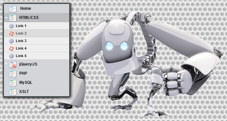
Here are final result (what we will creating):
Here are samples and downloadable package:
Live Demo
[sociallocker]
download in package
[/sociallocker]
Ok, download the example files and lets start coding !
Step 1. HTML
As usual, we start with the HTML. Here are full html code of our menu. As you can see – menu contain only 1 sub level. Hope this is will enough for you. Whole menu built on UL-LI elements.
index.html
<!DOCTYPE html>
<html lang="en" >
    <head>
        <meta charset="utf-8" />
        <title>CSS3 Onclick Vertical Metal menu | Dev School</title>

        <link rel="stylesheet" href="css/layout.css" type="text/css" media="screen">
        <link rel="stylesheet" href="css/menu.css" type="text/css" media="screen">
    </head>
    <body>
        <div class="container">

            <ul id="nav">
                <li><a href="#"><img src="images/t1.png" /> Home</a></li>
                <li><a href="#" class="sub" tabindex="1"><img src="images/t2.png" />HTML/CSS</a><img src="images/up.gif" alt="" />
                    <ul>
                        <li><a href="#"><img src="images/empty.gif" />Link 1</a></li>
                        <li><a href="#"><img src="images/empty.gif" />Link 2</a></li>
                        <li><a href="#"><img src="images/empty.gif" />Link 3</a></li>
                        <li><a href="#"><img src="images/empty.gif" />Link 4</a></li>
                        <li><a href="#"><img src="images/empty.gif" />Link 5</a></li>
                    </ul>
                </li>
                <li><a href="#" class="sub" tabindex="1"><img src="images/t3.png" />jQuery/JS</a><img src="images/up.gif" alt="" />
                    <ul>
                        <li><a href="#"><img src="images/empty.gif" />Link 6</a></li>
                        <li><a href="#"><img src="images/empty.gif" />Link 7</a></li>
                        <li><a href="#"><img src="images/empty.gif" />Link 8</a></li>
                        <li><a href="#"><img src="images/empty.gif" />Link 9</a></li>
                        <li><a href="#"><img src="images/empty.gif" />Link 10</a></li>
                    </ul>
                </li>
                <li><a href="#"><img src="images/t2.png" />PHP</a></li>
                <li><a href="#"><img src="images/t2.png" />MySQL</a></li>
                <li><a href="#"><img src="images/t2.png" />XSLT</a></li>
            </ul>

        </div>

        <footer>
            <h2>CSS3 Onclick Vertical Metal menu</h2>
            <a href="https://dev-school.net/css3-onclick-vertical-metal-menu/" class="stuts">Back to original tutorial on <span>Dev School</span></a>
        </footer>
    </body>
</html>
Step 2. CSS
Here are the CSS styles of our menu. Maybe you’ve noticed – that in our html – I have two CSS files: layout.css and menu.css. The first file (layout.css) contain the styles of our test page. We will not publish these styles in this article, but if you wish – you can find these styles in the package.
css/menu.css
#nav {
    border:3px solid #3e4547;

    box-shadow:2px 2px 8px #000000;
    border-radius:3px;
    -moz-border-radius:3px;
    -webkit-border-radius:3px;
}
#nav, #nav ul {
    list-style:none;
    padding:0;
    width:200px;
}
#nav ul {
    position:relative;
    z-index:-1;
}
#nav li {
    position:relative;
    z-index:100;
}
#nav ul li {
    margin-top:-23px;

    -moz-transition:  0.4s linear 0.4s;
    -ms-transition: 0.4s linear 0.4s;
    -o-transition: 0.4s linear 0.4s;
    -webkit-transition: 0.4s linear 0.4s;
    transition: 0.4s linear 0.4s;
}
#nav li a {
    background-color:#d4d5d8;
    color:#000;
    display:block;
    font-size:12px;
    font-weight:bold;
    line-height:28px;
    outline:0;
    padding-left:15px;
    text-decoration:none;
}
#nav li a.sub {
    background:#d4d5d8 url("../images/down.gif") no-repeat;
}
#nav li a + img {
    cursor:pointer;
    display:none;
    height:28px;
    left:0;
    position:absolute;
    top:0;
    width:200px;
}
#nav li a img {
    border-width:0px;
    height:24px;
    line-height:28px;
    margin-right:8px;
    vertical-align:middle;
    width:24px;
}
#nav li a:hover {
    background-color:#bcbdc1;
}
#nav ul li a {
    background-color:#eee;
    border-bottom:1px solid #ccc;
    color:#000;
    font-size:11px;
    line-height:22px;
}
#nav ul li a:hover {
    background-color:#ddd;
    color:#444;
}
#nav ul li a img {
    background: url("../images/bulb.png") no-repeat;
    border-width:0px;
    height:16px;
    line-height:22px;
    margin-right:5px;
    vertical-align:middle;
    width:16px;
}
#nav ul li:nth-child(odd) a img {
    background:url("../images/bulb2.png") no-repeat;
}
#nav a.sub:focus {
    background:#bcbdc1;
    outline:0;
}
#nav a:focus ~ ul li {
    margin-top:0;

    -moz-transition:  0.4s linear;
    -ms-transition: 0.4s linear;
    -o-transition: 0.4s linears;
    -webkit-transition: 0.4s linears;
    transition: 0.4s linear;
}
#nav a:focus + img, #nav a:active + img {
    display:block;
}
#nav a.sub:active {
    background:#bcbdc1;
    outline:0;
}
#nav a:active ~ ul li {
    margin-top:0;
}
#nav ul:hover li {
    margin-top:0;
}
Live Demo
Conclusion
Hope you enjoyed with our new vertical menu, don’t forget to tell thanks and leave a comment 🙂 Good luck!