Night sky with twinkling stars
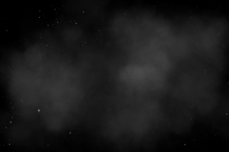
Have you noticed the beauty of the night sky? When lightly visible clouds slowly floating through the sky, and the stars twinkling behind them in the night sky. I think it’s a great show, so I decided to implement it by means of the Web technologies, without using javascript, all in pure CSS3. This article is intended more for beginners, but will also be useful for self-confident developers. First of all, I recommend you look at the demo, it will clearly show you that we’re going to do.
Preview

Live Demo 1
Live Demo 2
Live Demo 3
Live Demo 4
Step 1. HTML
Our composition consists of three basic elements: stars, twinkling and clouds.
index.html
    <div class="stars"></div>
    <div class="twinkling"></div>
    <div class="clouds"></div>
Step 2. CSS
Before I give all the styles I would like to explain the logic. As you might have guessed – floating clouds is the usual picture, just a cloud is implemented as a semi-transparent object that moves around the screen using CSS3 animation (with keyframes). Stars – also a constant object, it is the background to our scene. The time has come to find out – how to make twinkling stars. Speaking the truth, this is a simple trick again. To achieve this effect, it was necessary to add another moving image between stars and clouds (semi-transparent image with black spots, which cover the stars – unseen clouds).
style.css
@keyframes move-twink-back {
    from {background-position:0 0;}
    to {background-position:-10000px 5000px;}
}
@-webkit-keyframes move-twink-back {
    from {background-position:0 0;}
    to {background-position:-10000px 5000px;}
}
@-moz-keyframes move-twink-back {
    from {background-position:0 0;}
    to {background-position:-10000px 5000px;}
}
@-ms-keyframes move-twink-back {
    from {background-position:0 0;}
    to {background-position:-10000px 5000px;}
}

@keyframes move-clouds-back {
    from {background-position:0 0;}
    to {background-position:10000px 0;}
}
@-webkit-keyframes move-clouds-back {
    from {background-position:0 0;}
    to {background-position:10000px 0;}
}
@-moz-keyframes move-clouds-back {
    from {background-position:0 0;}
    to {background-position:10000px 0;}
}
@-ms-keyframes move-clouds-back {
    from {background-position: 0;}
    to {background-position:10000px 0;}
}

.stars, .twinkling, .clouds {
  position:absolute;
  top:0;
  left:0;
  right:0;
  bottom:0;
  width:100%;
  height:100%;
  display:block;
}

.stars {
  background:#000 url(images/stars.png) repeat top center;
  z-index:0;
}

.twinkling{
  background:transparent url(images/twinkling.png) repeat top center;
  z-index:1;

  -moz-animation:move-twink-back 200s linear infinite;
  -ms-animation:move-twink-back 200s linear infinite;
  -o-animation:move-twink-back 200s linear infinite;
  -webkit-animation:move-twink-back 200s linear infinite;
  animation:move-twink-back 200s linear infinite;
}

.clouds{
    background:transparent url(images/clouds.png) repeat top center;
    z-index:3;

  -moz-animation:move-clouds-back 200s linear infinite;
  -ms-animation:move-clouds-back 200s linear infinite;
  -o-animation:move-clouds-back 200s linear infinite;
  -webkit-animation:move-clouds-back 200s linear infinite;
  animation:move-clouds-back 200s linear infinite;
}
That’s it. Everything is ready now. In the package, you can find several versions of the images of clouds and stars – you can experiment.
Live Demo 1
Live Demo 2
Live Demo 3
Live Demo 4
[sociallocker]
download the sources
[/sociallocker]
Conclusion
That’s all for today, thanks for your patient attention, and if you really like what we did today – share it with all your friends in your social networks using the form below.
