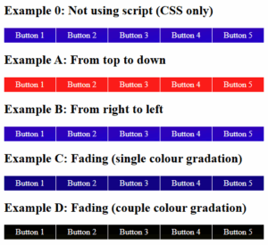
I think that you have already seen various animated menus with LavaLamp effect (based on jQuery plugin). Today I would like to tell you how to repeat the same behavior only with CSS3 (without any javascript). I had to use CSS3 transitions in our menu (to animate elements). So, if you are ready, let’s start.
Step 1. HTML
As usual, we start with the HTML. Here is the html code of our menu. As usual – this is again UL-LI based navigation menu. The most interesting thing will be CSS styles of course.
index.html
HTML
<ul id="nav">
    <li><a href="https://dev-school.net/">Home</a></li>
    <li><a class="hsubs" href="#">Menu 1</a>
        <ul class="subs">
            <li><a href="#">Submenu 1</a></li>
            <li><a href="#">Submenu 2</a></li>
            <li><a href="#">Submenu 3</a></li>
            <li><a href="#">Submenu 4</a></li>
            <li><a href="#">Submenu 5</a></li>
        </ul>
    </li>
    <li><a class="hsubs" href="#">Menu 2</a>
        <ul class="subs">
            <li><a href="#">Submenu 2-1</a></li>
            <li><a href="#">Submenu 2-2</a></li>
            <li><a href="#">Submenu 2-3</a></li>
            <li><a href="#">Submenu 2-4</a></li>
            <li><a href="#">Submenu 2-5</a></li>
            <li><a href="#">Submenu 2-6</a></li>
            <li><a href="#">Submenu 2-7</a></li>
            <li><a href="#">Submenu 2-8</a></li>
        </ul>
    </li>
    <li><a class="hsubs" href="#">Menu 3</a>
        <ul class="subs">
            <li><a href="#">Submenu 3-1</a></li>
            <li><a href="#">Submenu 3-2</a></li>
            <li><a href="#">Submenu 3-3</a></li>
            <li><a href="#">Submenu 3-4</a></li>
            <li><a href="#">Submenu 3-5</a></li>
        </ul>
    </li>
    <li><a href="#">Menu 4</a></li>
    <li><a href="#">Menu 5</a></li>
    <li><a href="#">Menu 6</a></li>
    <li><a href="https://dev-school.net/pure-css3-lavalamp-menu/">Back</a></li>
    <div id="lavalamp"></div>
</ul>
Step 2. CSS
Here are the CSS styles of our LavaLamp menu.
css/menu.css
CSS
#nav,#nav ul {
    list-style: none outside none;
    margin: 0;
    padding: 0;
}
#nav {
    background: url('menu_bg.png') no-repeat scroll 0 0 transparent;
    clear: both;
    font-size: 12px;
    height: 58px;
    padding: 0 0 0 9px;
    position: relative;
    width: 957px;
}
#nav ul {
    background-color: #222;
    border:1px solid #222;
    border-radius: 0 5px 5px 5px;
    border-width: 0 1px 1px;
    box-shadow: 0 5px 5px rgba(0, 0, 0, 0.5);
    left: -9999px;
    overflow: hidden;
    position: absolute;
    top: -9999px;
    z-index: 2;

    -moz-transform: scaleY(0);
    -ms-transform: scaleY(0);
    -o-transform: scaleY(0);
    -webkit-transform: scaleY(0);
    transform: scaleY(0);

    -moz-transform-origin: 0 0;
    -ms-transform-origin: 0 0;
    -o-transform-origin: 0 0;
    -webkit-transform-origin: 0 0;
    transform-origin: 0 0;

    -moz-transition: -moz-transform 0.1s linear;
    -ms-transition: -ms-transform 0.1s linear;
    -o-transition: -o-transform 0.1s linear;
    -webkit-transition: -webkit-transform 0.1s linear;
    transition: transform 0.1s linear;
}
#nav li {
    background: url('menu_line.png') no-repeat scroll right 5px transparent;
    float: left;
    position: relative;
}
#nav li a {
    color: #FFFFFF;
    display: block;
    float: left;
    font-weight: normal;
    height: 30px;
    padding: 23px 20px 0;
    position: relative;
    text-decoration: none;
    text-shadow: 1px 1px 1px #000000;
}
#nav li:hover > a {
    color: #00B4FF;
}
#nav li:hover, #nav a:focus, #nav a:hover, #nav a:active {
    background: none repeat scroll 0 0 #121212;
    outline: 0 none;
}
#nav li:hover ul.subs {
    left: 0;
    top: 53px;
    width: 180px;

    -moz-transform: scaleY(1);
    -ms-transform: scaleY(1);
    -o-transform: scaleY(1);
    -webkit-transform: scaleY(1);
    transform: scaleY(1);
}
#nav ul li {
    background: none;
    width: 100%;
}
#nav ul li a {
    float: none;
}
#nav ul li:hover > a {
    background-color: #121212;
    color: #00B4FF;
}
#lavalamp {
    background: url('lavalamp.png') no-repeat scroll 0 0 transparent;
    height: 16px;
    left: 13px;
    position: absolute;
    top: 0px;
    width: 64px;

    -moz-transition: all 300ms ease;
    -ms-transition: all 300ms ease;
    -o-transition: all 300ms ease;
    -webkit-transition: all 300ms ease;
    transition: all 300ms ease;
}
#lavalamp:hover {
    -moz-transition-duration: 3000s;
    -ms-transition-duration: 3000s;
    -o-transition-duration: 3000s;
    -webkit-transition-duration: 3000s;
    transition-duration: 3000s;
}
#nav li:nth-of-type(1):hover ~ #lavalamp {
    left: 13px;
}
#nav li:nth-of-type(2):hover ~ #lavalamp {
    left: 90px;
}
#nav li:nth-of-type(3):hover ~ #lavalamp {
    left: 170px;
}
#nav li:nth-of-type(4):hover ~ #lavalamp {
    left: 250px;
}
#nav li:nth-of-type(5):hover ~ #lavalamp {
    left: 330px;
}
#nav li:nth-of-type(6):hover ~ #lavalamp {
    left: 410px;
}
#nav li:nth-of-type(7):hover ~ #lavalamp {
    left: 490px;
}
#nav li:nth-of-type(8):hover ~ #lavalamp {
    left: 565px;
}
Conclusion
Hope you enjoyed with our new CSS3 menu, don’t forget to tell thanks and leave a comment 🙂 Good luck!