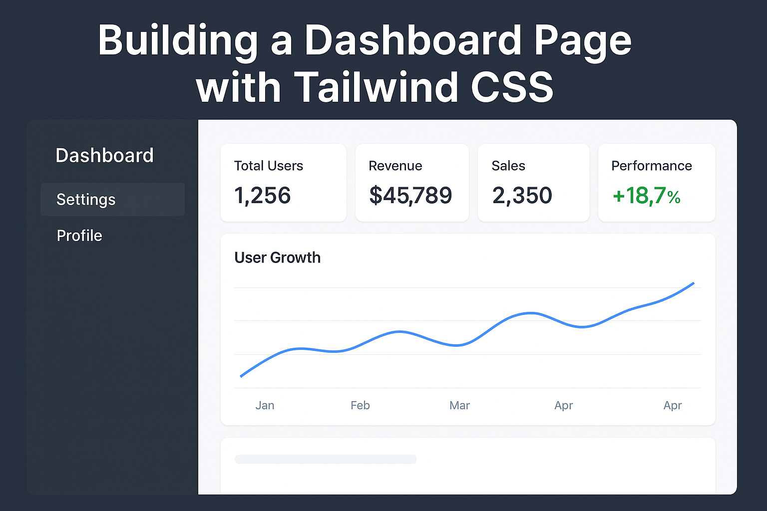
Tailwind CSS lets you build fast, responsive UIs using utility classes. In this tutorial, you’ll learn how to structure and style a simple dashboard layout with a sidebar, top navbar, and main content cards — all using HTML and Tailwind CSS.
Final Layout Overview
We’ll build:
- A sidebar with nav links
- A topbar with a title/search/user avatar
- A main content area with summary cards and other objects like:
- Notifications
- Storage usage
- System health
- Server status
- Tasks
- Support stats
- Responsive behavior for small screens
Setup Tailwind CSS
You can use the Tailwind CDN for quick prototyping:
index.html
HTML
<!DOCTYPE html>
<html lang="en">
<head>
  <meta charset="UTF-8" />
  <meta name="viewport" content="width=device-width, initial-scale=1.0" />
  <title>Dashboard</title>
  <script src="<a href="https://cdn.tailwindcss.com/" target="_blank" rel="noreferrer noopener">https://cdn.tailwindcss.com</a>"></script>
</head>
<body class="bg-gray-100 text-gray-900">
  <!-- Dashboard content here -->
</body>
</html>
HTML Structure
Here’s the full dashboard layout:
HTML
<div class="min-h-screen flex">

  <!-- Sidebar -->
  <aside class="w-64 bg-gray-800 text-white hidden md:block">
    <div class="p-6 text-xl font-bold border-b border-gray-700">
      MyDashboard
    </div>
    <nav class="p-4 space-y-2">
      <a href="#" class="block py-2 px-4 rounded hover:bg-gray-700">Dashboard</a>
      <a href="#" class="block py-2 px-4 rounded hover:bg-gray-700">Users</a>
      <a href="#" class="block py-2 px-4 rounded hover:bg-gray-700">Reports</a>
      <a href="#" class="block py-2 px-4 rounded hover:bg-gray-700">Settings</a>
    </nav>
  </aside>

  <!-- Main Content -->
  <div class="flex-1 flex flex-col">

    <!-- Topbar -->
    <header class="bg-white shadow px-6 py-4 flex justify-between items-center">
      <h1 class="text-xl font-semibold">Dashboard Overview</h1>
      <div class="flex items-center space-x-4">
        <input type="text" placeholder="Search…" class="border rounded px-3 py-1 text-sm focus:outline-none focus:ring focus:ring-blue-300" />
        <img src="<a href="https://i.pravatar.cc/32" target="_blank" rel="noreferrer noopener">https://i.pravatar.cc/32</a>" alt="avatar" class="rounded-full w-8 h-8" />
      </div>
    </header>

    <!-- Dashboard Cards -->
    <main class="p-6 grid grid-cols-1 md:grid-cols-2 lg:grid-cols-3 gap-6">

      <div class="bg-white p-4 rounded shadow">
        <h2 class="text-lg font-medium">Users</h2>
        <p class="text-3xl font-bold mt-2">1,245</p>
      </div>

      <div class="bg-white p-4 rounded shadow">
        <h2 class="text-lg font-medium">Revenue</h2>
        <p class="text-3xl font-bold mt-2">$13,000</p>
      </div>

      <div class="bg-white p-4 rounded shadow">
        <h2 class="text-lg font-medium">Open Tickets</h2>
        <p class="text-3xl font-bold mt-2">34</p>
      </div>

      <div class="bg-white p-4 rounded shadow">
        <h2 class="text-lg font-medium">New Notifications</h2>
        <ul class="text-sm mt-2 space-y-1">
          <li>📧 5 unread messages</li>
          <li>⚠️ 2 system alerts</li>
        </ul>
      </div>

      <div class="bg-white p-4 rounded shadow">
        <h2 class="text-lg font-medium">Storage Usage</h2>
        <div class="mt-2 w-full bg-gray-200 h-4 rounded-full overflow-hidden">
          <div class="bg-blue-500 h-full w-3/4"></div>
        </div>
        <p class="text-sm mt-1 text-gray-600">75% of 100GB used</p>
      </div>

      <div class="bg-white p-4 rounded shadow">
        <h2 class="text-lg font-medium">System Health</h2>
        <p class="mt-2 text-green-600 font-semibold">✓ All systems operational</p>
      </div>

      <div class="bg-white p-4 rounded shadow">
        <h2 class="text-lg font-medium">Server Status</h2>
        <ul class="text-sm mt-2 space-y-1">
          <li>🟢 API Server: Online</li>
          <li>🟡 DB Server: High Load</li>
          <li>🔴 Cache Server: Offline</li>
        </ul>
      </div>

      <div class="bg-white p-4 rounded shadow">
        <h2 class="text-lg font-medium">Tasks</h2>
        <ul class="text-sm mt-2 list-disc pl-5">
          <li>Fix dashboard bug</li>
          <li>Review PR #42</li>
          <li>Write Q3 Report</li>
        </ul>
      </div>

      <div class="bg-white p-4 rounded shadow">
        <h2 class="text-lg font-medium">Support Tickets</h2>
        <p class="text-3xl font-bold mt-2">12</p>
        <p class="text-sm text-gray-500">respond within 24h</p>
      </div>

      <!-- Wide Activity Section -->
      <div class="bg-white p-4 rounded shadow col-span-1 md:col-span-2 lg:col-span-3">
        <h2 class="text-lg font-medium">Recent Activity</h2>
        <ul class="mt-2 text-sm space-y-1">
          <li>📦 Order #1024 was shipped</li>
          <li>👤 New user registered</li>
          <li>🛠️ Server maintenance completed</li>
          <li>📥 Feedback received from client</li>
        </ul>
      </div>

    </main>

  </div>

</div>
Responsive Features
- On small screens (
md:hidden), the sidebar is hidden. You can add a toggle later. - The dashboard cards adapt using
grid-cols-1,md:grid-cols-2,lg:grid-cols-3.
Why This Helps
These additions simulate what you’d see in real dashboards:
- Resource usage (storage, servers)
- Notifications and activity logs
- Task management
- Real-time metrics
You now have a 12-card layout, giving users deeper visibility into the system.
Please follow and like us: