In modern CSS3, there is also a series of filters for manipulating the image visually by adding such effects like blurring, changing colors, controlling brightness, or giving an old-style appearance without using Photoshop/GIMP on the original image.
The most important thing is that these effects are applied without loading new images and are extremely fast and light-weighted in terms of performance.
1. What is a CSS Filter?
A CSS filter manipulates the image by applying graphic effects. It is used for:
- Dynamic enhancement of image appearance
- Application of hover or animation effects
- Combination of several effects
Syntax:
selector {
  filter: <filter-function>;
}
2. Main CSS Filters
Most commonly used filters include:
blur(px)– Gaussian blur effect;brightness(%)– changes the brightness level;contrast(%)– changes the contrast level;grayscale(%)– black and white image;sepia(%)– old-style effect;saturate(%)– changes the saturation;invert(%)– inverts the color;hue-rotate(deg)– rotates colors on a certain degree;drop-shadow(x y blur color)– applies shadow (better than box-shadow).
3. Example
HTML:
<div class="gallery">
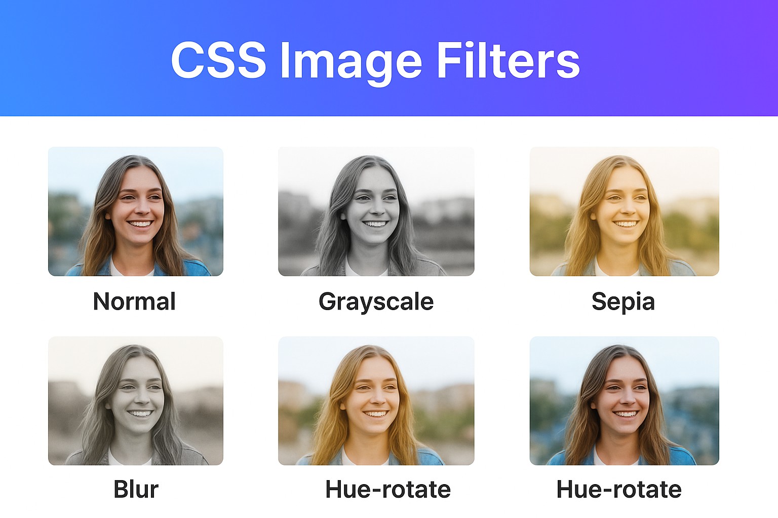
<img src="photo.jpg" alt="Sample" class="normal">
<img src="photo.jpg" alt="Sample" class="grayscale">
<img src="photo.jpg" alt="Sample" class="sepia">
<img src="photo.jpg" alt="Sample" class="blur">
<img src="photo.jpg" alt="Sample" class="hue">
</div>
CSS:
.gallery img {
  width: 200px;
  margin: 10px;
  border-radius: 8px;
}

.normal {
  filter: none;
}

.grayscale {
  filter: grayscale(100%);
}

.sepia {
  filter: sepia(80%);
}

.blur {
  filter: blur(3px);
}

.hue {
  filter: hue-rotate(120deg);
}
As a result, you will see several versions of the same image with different effects applied.
4. Combination of CSS Filters
When combining several filters:
.vintage {
  filter: sepia(70%) contrast(120%) brightness(90%);
}
This gives a retro look
5. Applying Filter on Hover
It is possible to add hover events on top of filters:
img.hover-effect {
  filter: grayscale(100%);
  transition: filter 0.3s ease;
}

img.hover-effect:hover {
  filter: grayscale(0%) brightness(110%);
}
This changes the color of the image to grayscale and back when hovered.
6. Animated Filters
Filters can also be animated using CSS transitions or keyframes:
@keyframes pulse {
  0% { filter: brightness(100%) }
  50% { filter: brightness(150%) saturate(150%) }
  100% { filter: brightness(100%) }
}

img.animated {
  animation: pulse 2s infinite;
}
7. Practical Examples in Use
- Image galleries – effects on hovering for stylish previews
- Hero banners – using blur and brightness for better legibility
- Themes like retro/UIs – sepia or gray filter
- Accessibility modes – using filters such as invert or reduce brightness for light/dark themes.
Conclusion
Using CSS filters is a great way to enhance the appearance of images, all without much effort in graphics editing. You can utilize CSS filters for purposes such as styling, interaction, animation, and accessibility.
Experiment with different combinations, just like Instagram filters but using CSS!