CSS Grid is one of the most powerful layout systems in modern web development. It gives you complete control over rows, columns, and alignment – all in pure CSS.
In this tutorial, we’ll walk through everything from basic setup to advanced examples so you can confidently design flexible, responsive layouts.
What Is CSS Grid?
CSS Grid is a 2-dimensional layout system for the web. Unlike Flexbox, which is primarily 1-dimensional (either row or column), Grid lets you control both rows and columns simultaneously.
A grid layout consists of a parent container (the grid) and its child elements (the grid items).
Getting Started with CSS Grid
Let’s start with a simple grid example.
HTML
<div class="grid-container">
  <div class="item">1</div>
  <div class="item">2</div>
  <div class="item">3</div>
  <div class="item">4</div>
  <div class="item">5</div>
  <div class="item">6</div>
</div>
CSS
.grid-container {
  display: grid;
  grid-template-columns: auto auto auto;
  gap: 10px;
  background-color: #1e3a8a;
  padding: 10px;
}

.item {
  background-color: #93c5fd;
  border: 1px solid #1e40af;
  padding: 20px;
  text-align: center;
  font-size: 1.2em;
}
Explanation:
display: gridactivates grid layout.grid-template-columnsdefines 3 equal-width columns.gapsets spacing between grid cells.
Result: You get a neat 3-column grid with evenly spaced boxes.
Defining Rows and Columns Precisely
You can define exact sizes for rows and columns using pixel, percentage, or fractional units (fr).
.grid-container {
  display: grid;
  grid-template-columns: 1fr 2fr 1fr;
  grid-template-rows: 100px 200px;
  gap: 15px;
}
Here, the grid has:
- Three columns (the middle one twice as wide as the others)
- Two rows (100px and 200px tall)
The fr Unit: Fractional Space
fr divides available space into flexible fractions.
Example:
grid-template-columns: 1fr 1fr 1fr;Each column takes up one-third of the available width — perfect for responsive design.
Grid Lines and Spanning
You can control where elements start and end using grid line numbers.
.item1 {
  grid-column: 1 / 3;
  grid-row: 1 / 2;
}
This means .item1 will span from column line 1 to 3 (covering two columns).
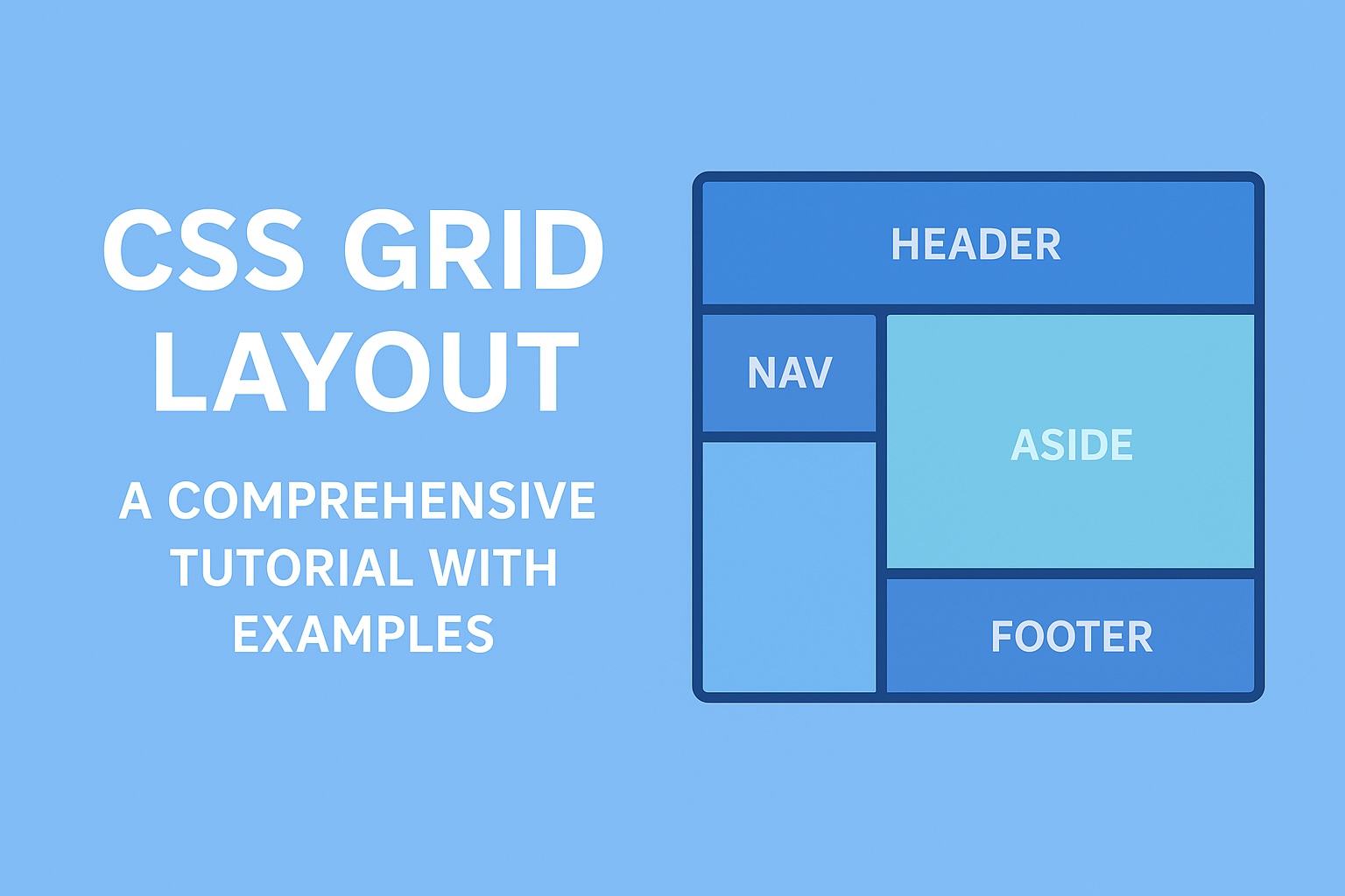
Named Grid Areas
You can name grid areas for more semantic and readable layout definitions.
Example:
<div class="grid-layout">
  <header>Header</header>
  <nav>Menu</nav>
  <main>Content</main>
  <aside>Sidebar</aside>
  <footer>Footer</footer>
</div>
CSS
.grid-layout {
  display: grid;
  grid-template-areas:
    "header header header"
    "nav main aside"
    "footer footer footer";
  grid-template-columns: 1fr 3fr 1fr;
  grid-template-rows: auto 1fr auto;
  height: 100vh;
}

header  { grid-area: header; background: #3b82f6; }
nav     { grid-area: nav; background: #60a5fa; }
main    { grid-area: main; background: #93c5fd; }
aside   { grid-area: aside; background: #bfdbfe; }
footer  { grid-area: footer; background: #1e3a8a; color: white; }
Result:
A full-page responsive layout with header, navigation, main content, sidebar, and footer — all organized neatly.
Implicit vs. Explicit Grid
Explicit Grid: Defined with grid-template-columns and grid-template-rows.
Implicit Grid: Created automatically when items exceed defined boundaries.
You can control how implicit rows behave using:
grid-auto-rows: 100px;
grid-auto-columns: 1fr;
Alignment and Justification
Grid provides powerful alignment options:
.grid-container {
  justify-items: center;
  align-items: center;
}
Or align the entire grid content:
.grid-container {
  justify-content: space-evenly;
  align-content: center;
}
Responsive Design with CSS Grid
You can make your grid responsive with media queries or auto-fit and auto-fill.
.grid-container {
  display: grid;
  grid-template-columns: repeat(auto-fit, minmax(200px, 1fr));
  gap: 15px;
}
This layout automatically adjusts the number of columns based on available screen space.
Combining Flexbox and Grid
You can use Grid for the main structure and Flexbox for inner alignment.
Example:
<div class="grid">
  <div class="card">
    <div class="card-content">Centered Text</div>
  </div>
</div>.grid {
display: grid;
grid-template-columns: repeat(3, 1fr);
gap: 20px;
}
.card {
background: #93c5fd;
display: flex;
align-items: center;
justify-content: center;
height: 150px;
border-radius: 8px;
}Advanced Example: Photo Gallery Layout
<div class="photo-grid">
  <div class="photo large">1</div>
  <div class="photo">2</div>
  <div class="photo">3</div>
  <div class="photo wide">4</div>
  <div class="photo">5</div>
  <div class="photo">6</div>
</div>.photo-grid {
display: grid;
grid-template-columns: repeat(auto-fit, minmax(150px, 1fr));
grid-auto-rows: 150px;
gap: 10px;
}
.photo {
background: #60a5fa;
color: white;
display: flex;
align-items: center;
justify-content: center;
font-size: 1.5em;
}
.photo.large {
grid-row: span 2;
}
.photo.wide {
grid-column: span 2;
}This creates a flexible, responsive image grid similar to Pinterest layouts.
Why CSS Grid Is Game-Changing
- Simplifies complex layouts
- Replaces floats and positioning hacks
- Works beautifully with responsive design
- Integrates well with Flexbox
- Supported in all modern browsers
Summary
| Concept | Description |
|---|---|
display: grid | Defines a grid container |
grid-template-columns | Defines column structure |
grid-template-rows | Defines row structure |
gap | Sets spacing between cells |
grid-area | Assigns names to regions |
fr | Flexible sizing unit |
auto-fit / auto-fill | Auto-adjusts columns for responsiveness |