Modern CSS3 includes a set of image filters that allow you to add visual effects—like blurring, color shifts, brightness control, or even retro looks—without editing the original image in Photoshop or GIMP. These filters are efficient, lightweight, and can be applied directly via CSS.
1. What are CSS Filters?
CSS filters apply graphic effects to images, backgrounds, or even entire elements. They can:
- Enhance visuals dynamically.
- Allow hover/animation effects.
- Be combined together for complex effects.
Syntax:
selector {
  filter: <filter-function>;
}
2. Common CSS Filters
Here are the most frequently used filters:
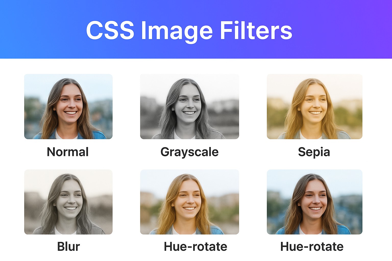
blur(px)– applies Gaussian blur.brightness(%)– adjusts brightness.contrast(%)– adjusts contrast.grayscale(%)– converts to black & white.sepia(%)– applies a vintage/old look.saturate(%)– increases or decreases color intensity.invert(%)– inverts colors.hue-rotate(deg)– rotates color wheel.drop-shadow(x y blur color)– applies shadow (like box-shadow but better for images).
3. Basic Examples
HTML:
<div class="gallery">
  <img src="photo.jpg" alt="Sample" class="normal">
  <img src="photo.jpg" alt="Sample" class="grayscale">
  <img src="photo.jpg" alt="Sample" class="sepia">
  <img src="photo.jpg" alt="Sample" class="blur">
  <img src="photo.jpg" alt="Sample" class="hue">
</div>
CSS:
.gallery img {
  width: 200px;
  margin: 10px;
  border-radius: 8px;
}

.normal {
  filter: none;
}

.grayscale {
  filter: grayscale(100%);
}

.sepia {
  filter: sepia(80%);
}

.blur {
  filter: blur(3px);
}

.hue {
  filter: hue-rotate(120deg);
}
Result: you’ll see the same image with different effects side by side.
4. Combining Filters
You can chain multiple filters together:
.vintage {
  filter: sepia(70%) contrast(120%) brightness(90%);
}
This produces a warm, retro look.
5. Filters with Hover Effects
Add interactivity by applying filters on hover:
img.hover-effect {
  filter: grayscale(100%);
  transition: filter 0.3s ease;
}

img.hover-effect:hover {
  filter: grayscale(0%) brightness(110%);
}
This starts the image in grayscale, then returns it to full color when hovered.
6. Animated Filters
Filters can be animated using CSS transitions or keyframes:
@keyframes pulse {
  0% { filter: brightness(100%) }
  50% { filter: brightness(150%) saturate(150%) }
  100% { filter: brightness(100%) }
}

img.animated {
  animation: pulse 2s infinite;
}
7. Real-World Use Cases
- Image galleries – hover effects for stylish previews.
- Hero banners – applying blur + brightness for text readability.
- Retro/UIs themes – sepia or grayscale modes.
- Accessibility modes – invert or reduce brightness for dark/light themes.
Conclusion
CSS filters are a powerful way to bring images to life without heavy graphics editing. You can use them for styling, interactivity, animations, or accessibility features.
Try experimenting with combinations—just like Instagram filters, you can create unique looks directly with CSS!